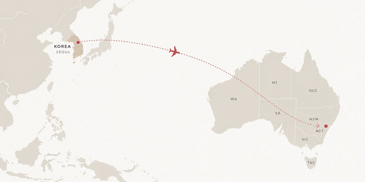
A KOREAN BRAND, REIMAGINED FOR AUSTRALIA.
Translating an established Korean pizza brand into a new spatial identity for the Australian market.

Pizza25 arrived in Australia with an established identity and a new ambition.
Our role was not simply to replicate the Korean stores, but to translate the brand for a new market — creating an environment that felt fresh, bold and unmistakably Pizza25.

We start by understanding the brand’s existing identity, values and visual language — identifying what makes it recognisable and worth preserving.
We identify the strongest elements of the original brand and explore how they can translate beyond graphics into a physical customer experience.
We refine the brand for the Australian market, considering local customers, context and expectations while retaining its original character.
Branding, colour, illustration, graphics, materials and spatial elements are brought together into one cohesive design language.
Recognisable to the original brand, but designed for its new Australian context.
We help international hospitality brands translate their identity into spaces designed for the Australian market.
We use cookies to analyze website traffic and optimize your website experience. By accepting our use of cookies, your data will be aggregated with all other user data.